Swiperのデザインをいい感じにカスタマイズする方法
こんにちは。
久しぶりの更新になってしまいました。
今回のお話はSwiperを使って「前へ、次へ」の矢印のデザインなどを自身でカスタマイズする方法を紹介していきます。
対象者
- Swiperのデザインをカスタマイズしたい方。
- Swiperの基礎がある程度わかっている方。
「前へ、次へ」の矢印のデザインとページネーションのデザインを変更する方法
デフォルトで設定した「前へ、次へ」の矢印はしたの画像のような青色の矢印であったりページネーションです。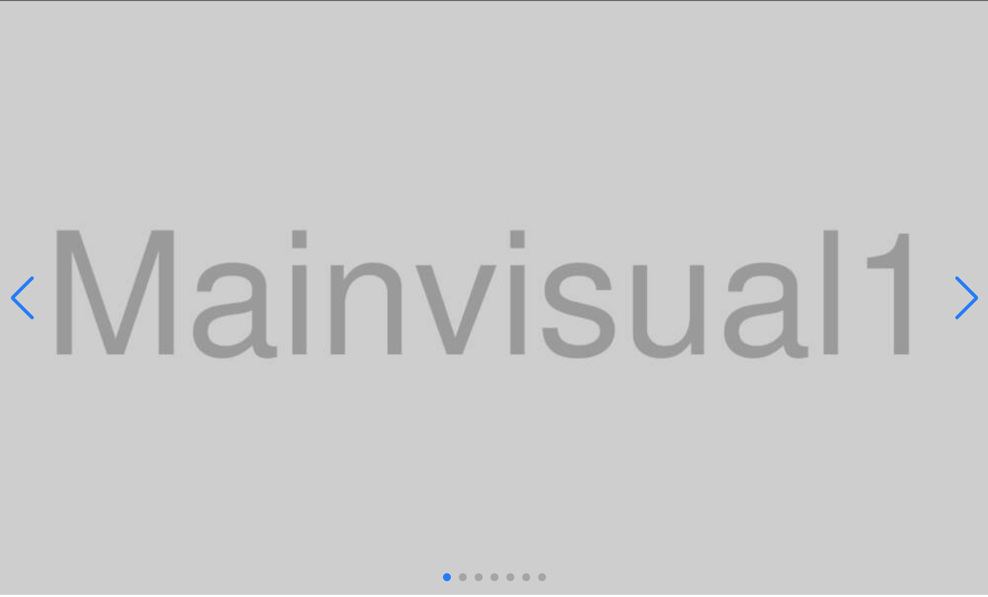
それを今回はしたの画像のようにCSSで変更してみたいと思います。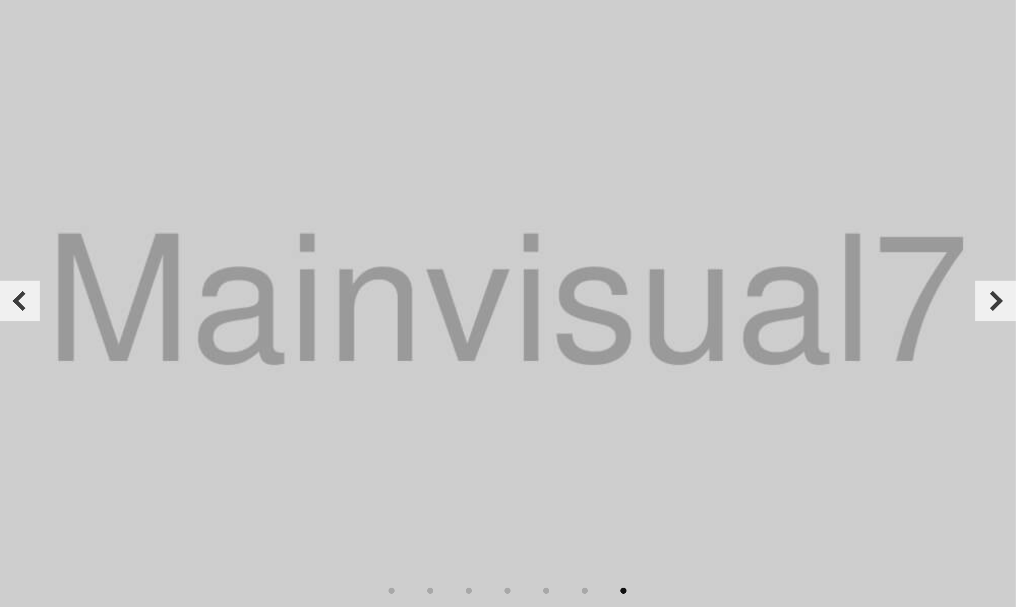
まずは「前へ、次へ」の矢印のデザインから変えていきます。
.swiper-button-prev::after,
.swiper-button-next::after {
  content: "";
}上記のセレクタを弄るのですが、デフォルトでは.swiper-button-prev::afterにcontent: "prev"; 、.swiper-button-next::afterにcontent: "next"; が設定されていて、各青い矢印が表示されています。これをcontent: ""; で打ち消してやります。
打ち消した後に、各セレクタに矢印とかをCSSで記述していきます。
.swiper-button-prev::after,
.swiper-button-next::after {
  content: "";
}

.swiper-button-prev {
  width: 40px;
  height: 40px;
  background-color: #fff;
  cursor: pointer;
  opacity: 0.7;
  left: 0;
}

.swiper-button-prev::after {
  display: inline-block;
  vertical-align: middle;
  color: #000;
  line-height: 1;
  width: 14px;
  height: 14px;
  border: 4px solid currentColor;
  border-left: 0;
  border-bottom: 0;
  box-sizing: border-box;
  transform: translateX(23%) rotate(-135deg);
}

.swiper-button-next {
  width: 40px;
  height: 40px;
  background-color: #fff;
  cursor: pointer;
  opacity: 0.7;
  right: 0;
}

.swiper-button-next::after {
  display: inline-block;
  vertical-align: middle;
  color: #000;
  line-height: 1;
  width: 14px;
  height: 14px;
  border: 4px solid currentColor;
  border-left: 0;
  border-bottom: 0;
  box-sizing: border-box;
  transform: translateX(-20%) rotate(-315deg);
}
次にページネーションのデザインを変更していきます。
ページネーションのデザインを変更する場合は.swiper-pagination-bulletを触ります。
.swiper-pagination-bullet {
  background-color: #111;
  height: 6px;
  width: 6px;
  margin: 0 16px !important;
}
左右にはみ出すスライド
自分自身も執筆していて表現が正しいのか微妙なかんじですが下記の画像のようなデザインです。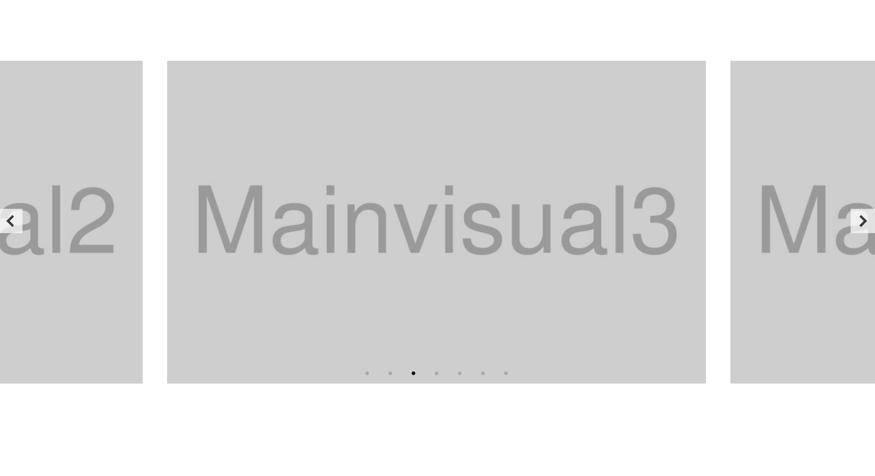
new Swiper(".swiper", {
  loop: true,
  speed: 500,
  autoplay: {
    delay: 3500,
    disableOnInteraction: false,
  },
  pagination: {
    el: ".swiper-pagination",
    clickable: true,
  },
  navigation: {
    nextEl: ".swiper-button-next",
    prevEl: ".swiper-button-prev",
  },
  centeredSlides: true,
  slidesPerView: 1,
  breakpoints: {
    600: {
      slidesPerView: 1.6,
      spaceBetween: 40,
    },
  },
});
左右にはみ出すスライドを実装するために重要になってくるプロパティはslidesPerViewです。
このプロパティは画面に何枚のスライドを表示させるかを指定するものでデフォルトの値は「1」です。
これを「1.6」などのように小数にすることで、複数スライドを表示かつスライドをはみ出させることができます。
もう一つ、重要なプロパティがあります。それがcenteredSlidesです。
このプロパティの値を「true」にすることでスライドが中央寄せで表示されるようになります。
あとはspaceBetweenでスライド間の余白を調整すれば完成です。
※CSSのmarginプロパティでスライド間を開けるより、こちらを使う方が推奨されています。
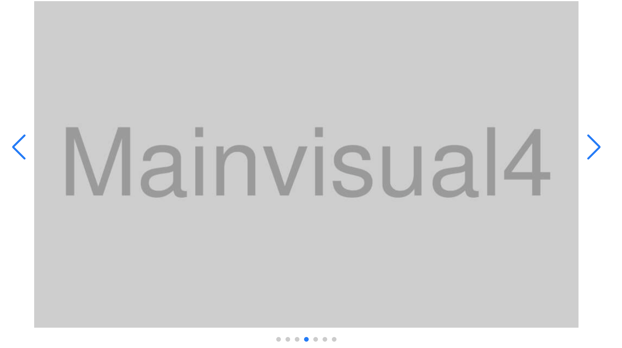
「前へ、次へ」の矢印、ページネーションを外に出す
「前へ、次へ」の矢印、ページネーションを外に出す場合まずはHTML構造を変更する必要があります。
通常のHTML構造では下記の通りです。
<div class="swiper">
  <div class="swiper-wrapper">
    <div class="swiper-slide">
      <img src="img/・・・" alt="" />
    </div>
    <div class="swiper-slide">
      <img src="img/・・・" alt="" />
    </div>
    <div class="swiper-slide">
      <img src="img/・・・" alt="" />
    </div>
  </div>
  <div class="swiper-pagination"></div>
  <div class="swiper-button-prev"></div>
  <div class="swiper-button-next"></div>
</div>
これを以下のように作り替えます。
<div class="wrapper">
  <div class="swiper">
    <div class="swiper-wrapper">
      <div class="swiper-slide">
        <img src="img/・・・" alt="" />
      </div>
      <div class="swiper-slide">
        <img src="img/・・・" alt="" />
      </div>
      <div class="swiper-slide">
        <img src="img/・・・" alt="" />
      </div>
    </div>
  </div>
  <div class="swiper-pagination"></div>
  <div class="swiper-button-prev"></div>
  <div class="swiper-button-next"></div>
</div>.swiperをさらにdiv要素で囲み.swiper-pagination、.swiper-button-prev、.swiper-button-nextを.swiperと同じ階層に配置します。.swiperには「overflow:hidden」がついており、これはswiperスライダにおいて外せないものなので、「前へ、次へ」の矢印、ページネーションのパーツを外に移動させたいからです。
HTML構造を書き換えたらCSSで位置を調整します。
ここで注意が必要なのですが必ず一番外側のdiv要素に「position: relative」を指定してください。
.wrapper {
  position: relative;
}
ここまで来たら後は各々適当に各々調整してください。
.swiper-button-prev {
  left: -10px;
}

.swiper-button-next {
  right: -10px;
}

.swiper-pagination {
  bottom: -30px !important;
}
まとめ
今回はSwiperのデザインを変更する方法をご紹介しました。
デフォルトの青のままのデザインだけでもいいのですが、Web制作の場面でほぼデフォルトの青のままのデザインで終わる場面はほぼないと思います。そんな場面でも自分でデザインをカスタマイズできるようになればSwiperがもっと使いやすくなるはずです。
この記事を読んで少しでも参考になれば幸いです。